Editor Theming
The editor has two related theme layers:
| Layer | Prop | Purpose |
|---|---|---|
| Content theme | theme | The ElucimTheme used by rendered scene content. The editor derives chrome tokens from it. |
| Editor chrome | editorTheme | Explicit overrides for toolbar, docks, inspector, timeline, graph, inputs, borders, and shadows. |
Use theme when you want the scene and editor to share one visual language. Use editorTheme when you only want to override the editor UI.
Quick chrome override
Section titled “Quick chrome override”import { ElucimEditor } from '@elucim/editor';
export function App() { return ( <ElucimEditor editorTheme={{ accent: '#e040fb', bg: '#1e1e2e', surface: '#181825', fg: '#cdd6f4', border: '#45475a', }} style={{ width: '100vw', height: '100vh' }} /> );}Bare names such as accent are expanded to CSS variables such as --elucim-editor-accent.
Light mode
Section titled “Light mode”Pass color-scheme: 'light' through editorTheme to use light defaults:
<ElucimEditor editorTheme={{ 'color-scheme': 'light' }} style={{ width: '100vw', height: '100vh' }}/>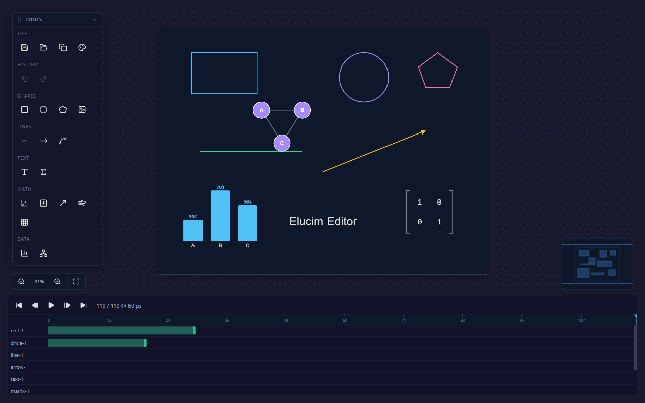
Unified content + chrome theme
Section titled “Unified content + chrome theme”Pass the same ElucimTheme you use with <DslRenderer>. The editor maps content tokens to chrome tokens with deriveEditorTheme().
import { DslRenderer } from '@elucim/dsl/react';import { ElucimEditor } from '@elucim/editor';import type { ElucimTheme } from '@elucim/core';
const theme: ElucimTheme = {  background: '#0f172a',  surface: '#1e293b',  foreground: '#e2e8f0',  title: '#f8fafc',  subtitle: '#94a3b8',  muted: '#64748b',  accent: '#38bdf8',  primary: '#38bdf8',  border: '#334155',  success: '#34d399',  error: '#fb7185',};
<DslRenderer dsl={doc} theme={theme} colorScheme="dark" />;<ElucimEditor initialDocument={doc} theme={theme} />;
Use editorTheme on top when chrome needs a local override:
<ElucimEditor initialDocument={doc} theme={theme} editorTheme={{ accent: '#ff6b35' }}/>Token defaults
Section titled “Token defaults”| Token | Dark default | Light default | Role |
|---|---|---|---|
accent | #4a9eff | #2563eb | Selection, active tabs, focus rings, key actions |
bg | #1a1a2e | #f1f5f9 | Outer editor background |
surface | #12122a | #ffffff | Docks, panels, graph surfaces |
panel | rgba(22, 22, 42, 0.93) | rgba(255, 255, 255, 0.95) | Floating/overlay panel surfaces |
chrome | rgba(15, 23, 42, 0.8) | rgba(241, 245, 249, 0.9) | Timeline and toolbar chrome |
fg | #e0e0e0 | #1e293b | Primary text |
text-secondary | #94a3b8 | #334155 | Labels and secondary text |
text-muted | #64748b | #64748b | Hints, empty states, low-emphasis metadata |
text-disabled | #475569 | #94a3b8 | Disabled controls |
border | #334155 | #e2e8f0 | Primary separators and panel borders |
border-subtle | #1e293b | #f1f5f9 | Low-emphasis dividers |
input-bg | #0f172a | #ffffff | Inputs and compact data editors |
success | #34d399 | #34d399 | Positive status and text/math type accents |
info | #4fc3f7 | #4fc3f7 | Informational status |
error | #f87171 | #f87171 | Errors and destructive feedback |
The editor also exposes sizing, spacing, radius, shadow, duration, and easing tokens:
--elucim-editor-input-height--elucim-editor-font-xs--elucim-editor-font-sm--elucim-editor-radius-sm--elucim-editor-space-xs--elucim-editor-space-sm--elucim-editor-shadow-panel--elucim-editor-shadow-dropdown--elucim-editor-duration-fast--elucim-editor-duration-normal--elucim-editor-easing-defaultToken helpers
Section titled “Token helpers”import { EDITOR_TOKENS, EDITOR_TOKENS_LIGHT, buildThemeVars, deriveEditorTheme, makeRotateCursor, v,} from '@elucim/editor';| Helper | Use |
|---|---|
v(token, scheme?) | Return var(--token, fallback) for inline styles. |
buildThemeVars(overrides) | Merge dark/light defaults with overrides and return CSS custom properties. |
deriveEditorTheme(contentTheme, scheme) | Map an ElucimTheme to editor chrome tokens. |
makeRotateCursor(color) | Generate the themed SVG cursor used by rotation handles. |
EDITOR_TOKENS | Dark-mode token registry. |
EDITOR_TOKENS_LIGHT | Light-mode token registry. |
Semi-transparent variants
Section titled “Semi-transparent variants”Use color-mix() with token references instead of appending alpha to CSS variables:
.custom-panel { background: color-mix(in srgb, var(--elucim-editor-surface) 92%, transparent); border: 1px solid color-mix(in srgb, var(--elucim-editor-border) 70%, transparent);}This is the same approach used by panel, tab, selection, and graph controls.
Design-token smoke testing
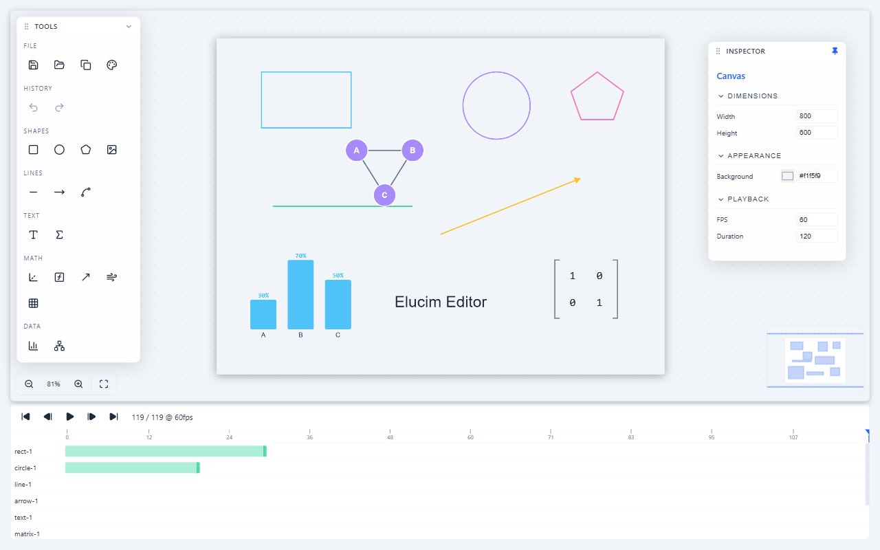
Section titled “Design-token smoke testing”When you change editor tokens, inspect both color schemes with dense scenes that show:
- top panel toggles,
- left Objects/Create/Polish dock,
- selected canvas content,
- inspector form fields,
- timeline tracks and keyframes,
- state-machine graph surfaces when relevant,
- context menus and overlay controls.
The light and dark screenshots on this page are generated from the editor playground and are intended to catch token regressions such as weak contrast, invisible borders, washed-out inputs, or panel surfaces blending into the canvas.
Next steps
Section titled “Next steps”- Back to the Editor Overview.
- Learn about the Inspector & Properties.
- See the Editor API Reference.