Editor Overview
The Elucim editor is a drop-in React workspace for building normalized ElucimDocument scenes visually. It edits the same JSON/YAML-compatible document model that <DslRenderer> renders: elements live in the document tree, motion lives in timelines and state machines, and generated polish can be reviewed before it changes the scene.
Installation
Section titled “Installation”pnpm add @elucim/editor @elucim/core @elucim/dsl react react-domQuick start
Section titled “Quick start”import { ElucimEditor } from '@elucim/editor';
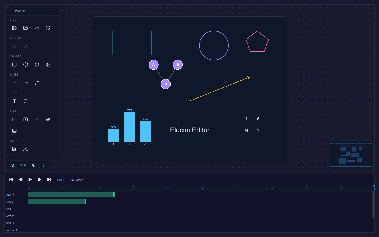
export function App() { return <ElucimEditor style={{ width: '100vw', height: '100vh' }} />;}This opens the full editor shell with an Objects/Create/Polish dock, canvas, inspector, zoom controls, minimap, and the motion panel.
Load a normalized document
Section titled “Load a normalized document”Pass an initialDocument to open an existing normalized scene. Edits are emitted through onDocumentChange as normalized ElucimDocument output.
import { ElucimEditor } from '@elucim/editor';import type { ElucimDocument } from '@elucim/dsl';
const scene: ElucimDocument = {  version: '2.0',  scene: {    type: 'player',    width: 1280,    height: 720,    fps: 60,    background: '$background',    children: ['title', 'node'],  },  elements: {    title: {      id: 'title',      type: 'text',      role: 'title',      props: { type: 'text', content: 'Energy transfer', x: 640, y: 96, fill: '$title', fontSize: 44, textAnchor: 'middle' },    },    node: {      id: 'node',      type: 'circle',      role: 'concept',      props: { type: 'circle', cx: 640, cy: 360, r: 84, fill: '$surface', stroke: '$accent', strokeWidth: 3 },    },  },  timelines: {    intro: {      id: 'intro',      duration: 60,      tracks: [        { target: 'title', property: 'opacity', keyframes: [{ frame: 0, value: 0 }, { frame: 60, value: 1 }] },      ],    },  },  metadata: { title: 'Energy transfer', intent: 'Show the main concept before adding detail.' },};
export function App() {  return (    <ElucimEditor      initialDocument={scene}      initialFrame="last"      onDocumentChange={(doc, details) => {        saveDocument(doc);        if (details.warnings.length > 0) showCompatibilityWarnings(details.warnings);      }}      style={{ width: '100vw', height: '100vh' }}    />  );}
initialFrame can be a frame number or 'last', which is useful when opening generated documents with reveal timelines.
Editor model
Section titled “Editor model”The editor no longer asks you to switch between broad Design, Animate, State Machine, and Polish workspace presets. The persistent shell keeps the same core surfaces visible so the document model stays obvious:
| Surface | Use it for |
|---|---|
| Objects | Browse the scene tree, select Objects, inspect generated IDs, understand groups, and reorder scene structure. |
| Create | Add template Objects to the scene. Templates become normal Elucim Document elements. |
| Polish | Review scene metadata, selected-object intent, validation warnings, compatibility notes, polish diagnostics, and suggested document nudges. |
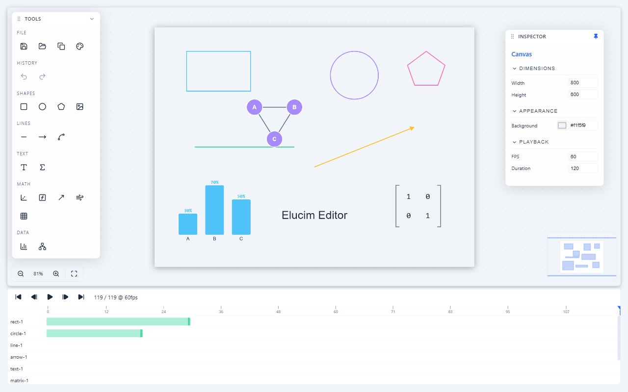
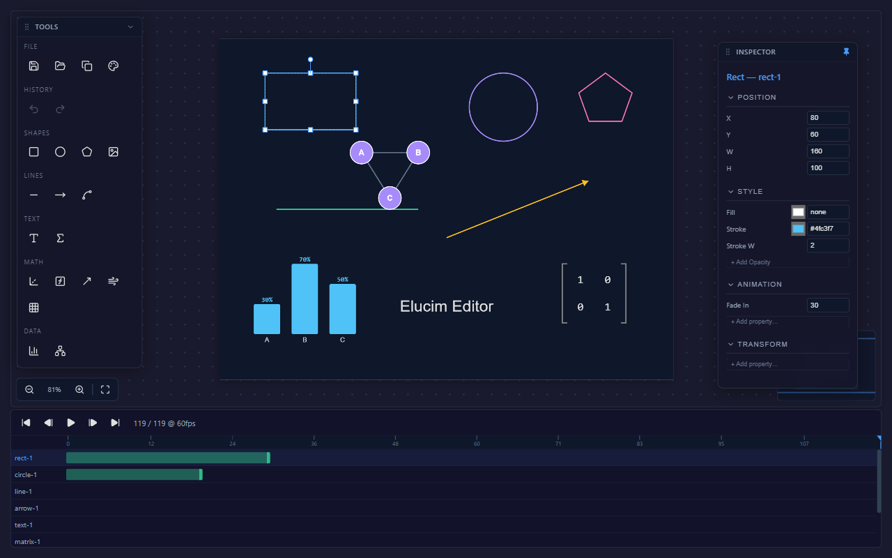
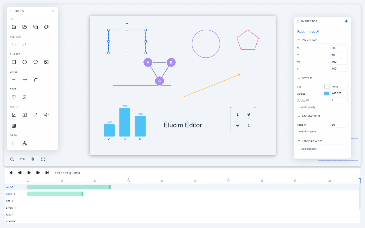
| Inspector | Edit the selected canvas or Object’s static properties, layout, style, transforms, and group details. |
| Timeline | Edit animation timelines, property tracks, keyframes, easing, and preview frames. |
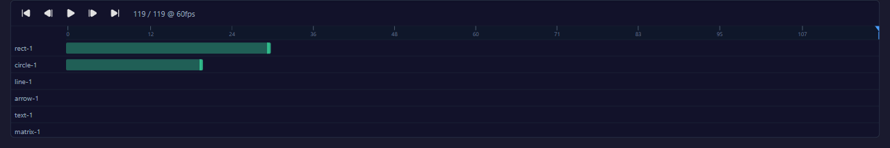
| Animations motion tab | Author timeline-based motion for Objects. |
| State machines motion tab | Wire timelines into Entry/state/Exit flows, transitions, trigger inputs, keyboard/click events, and preview behavior. |
Normalized documents open with motion visible so existing animations are immediately inspectable. New blank editor sessions emphasize Objects and the inspector first.
Layout
Section titled “Layout”The current editor shell is a docked scene-editing UI:
| Region | Purpose |
|---|---|
| Top bar | Show/hide toggles for the left panel, inspector, and timeline. |
| Left dock | Objects for scene structure, Create for element templates, and Polish for diagnostics and nudges. |
| Canvas | Pan/zoom stage with grid, selection overlay, context menu, minimap, and zoom controls. |
| Inspector | Contextual properties for the canvas or selected element. |
| Motion panel | Animations and State machines motion tabs for timeline editing and state-machine graphs. |
The left dock, inspector, and timeline are resizable. Hidden regions can be restored from the top bar or the collapsed rail.
Creating elements
Section titled “Creating elements”Open Create in the left dock and choose from the template palette:
| Category | Templates |
|---|---|
| Presentation | Title, Subtitle, Hero Card, Metric, Callout |
| Shape | Rectangle, Circle, Polygon, Image |
| Line | Line, Bezier Curve |
| Text | Text, LaTeX |
| Math | Axes, Function Plot, Vector, Vector Field, Matrix |
| Data | Bar Chart, Graph |
Templates insert normal scene Objects with sensible tokenized colors. Select the new Object and use the inspector for static properties, then use timelines/state machines for motion.
Selecting and arranging
Section titled “Selecting and arranging”- Click an element to select it; Shift/Ctrl/Cmd+click toggles multi-selection.
- Drag selected elements to move them; Alt+drag duplicates first, then drags the copy.
- Drag handles to resize; Shift+drag constrains uniform resizing.
- Use Objects or the right-click context menu for grouping, clipboard actions, layer order, align, and distribute.
- Double-click an item in Objects to rename it. Renames are mapped back into normalized output where possible.
Motion authoring
Section titled “Motion authoring”Motion is not authored as wrapper JSX. Use:
- Animations in the motion panel for timeline property tracks and keyframes on
opacity,translate,scale,rotate,fill, orstroke. - State machines in the motion panel to decide when timelines run and how users can move through animated states.
- Preview controls to scrub frames, play animation, or trigger state-machine events.
Import, export, and persistence
Section titled “Import, export, and persistence”For host applications, prefer onDocumentChange; it gives you the normalized output document. The toolbar Save, Open, and Copy actions are convenience UI for local JSON workflows. Imported Elucim Document JSON is validated and migrated into the editor working shape; output is restored to normalized document JSON when emitted.
Keyboard shortcuts
Section titled “Keyboard shortcuts”| Shortcut | Action |
|---|---|
Delete / Backspace | Delete selected elements |
Ctrl+Z | Undo |
Ctrl+Y / Ctrl+Shift+Z | Redo |
Ctrl+A | Select all elements |
Ctrl+D | Duplicate selected elements |
Ctrl+C / Ctrl+V | Copy / paste selected elements |
Ctrl+G / Ctrl+Shift+G | Group / ungroup |
Ctrl+] / Ctrl+[ | Bring forward / send backward |
Ctrl+Shift+] / Ctrl+Shift+[ | Bring to front / send to back |
| Arrow keys | Nudge selected elements by 1px |
| Shift+Arrow keys | Nudge by 10px |
Ctrl+= / Ctrl+- | Zoom in / out |
Ctrl+0 / Ctrl+1 | Fit to view / 100% zoom |
| Space (hold) | Pan mode |
| Escape | Deselect and return to select tool |
Next steps
Section titled “Next steps”- Learn about the Inspector & Properties.
- Customize chrome and content colors with Editor Theming.
- Integrate asset libraries with Image Assets.
- See the Editor API Reference.